|
|
| ||
Viewing the Results
While the experiment is running, or after it has just finished, you can access your results by looking at the Results tab of the Experimenter screen. A download of the data generated in the experiment is also available, however this data may only be displayed in html format. The more user-friendly graphical version of results may be accessed anytime after the experiment is over through the experimenter's account on Econport.
If you wish to review results after the experiment has run, log into your econport.org account. In the left-hand-side menu, click on “Experiments”.
You'll see a list of all experiments in your account. Choose the one whose results you want to see. In order to do this, click on the "results" button that is on the right side of the name of this experiment.
The Results reviewing screen is a saved copy of the Experimenters Screen (with all four tabs available) from the end of an experiment.
The Server Tab will be blank.
The Subject Info tab will show the identities of all of the participants in the experiment, their roles as a buyer or seller, and their final balances and payoffs. Buyers' balances is 1,000 times larger than their payoff because this allows them to overbid their value during the expeirment without going bankrupt.
The Market Activity Tab shows the same information as the Market History Tab with one exception: Only in the Market History Tab are you able to review period summary graphs and period summary tables for all periods. The Market Activity Tab will only show activity from the last period. The following screenshots show the graphs and tables in th Market History Tab from a completed experiment with 12 buyers and 12 sellers.
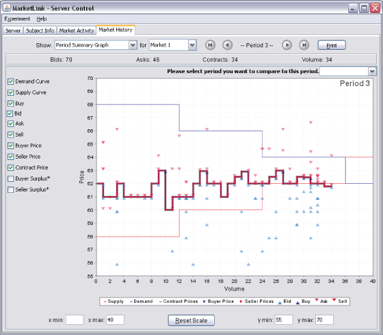
Period Summary Graph: The screen-shot below shows a summary of bidding and contracts made in the third period of a commodity double auction. Buyer bids are represented by the light-blue triangles, and Seller asks are represented by the light-red triangles. If a buyer decides to buy at the current best ask then a dark-blue triangle appears, and if a seller decides to sell at the current best bid then a dark-red triangle appears. The triangles are arranged vertically to show all the bids and asks made after the last unit was sold up to exactly when the next unit was sold. The contract price line shows the price at which each unit was sold.
(Click here to open a window image)
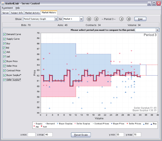
Period Summary Graph With Surpluses: You can also view the buyer surplus (shaded blue) and the seller surplus (shaded red). The remaining unshaded area between the stepwise demand and supply curves represents deadweight loss. Comparing the two areas it is clear that the buyers were effective at bidding for a lower price.
(Click here to open a window image)
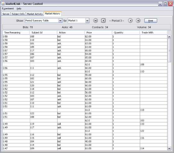
Period Summary Table: You can also view the exact price of bids, asks, buys, and sells in the Period Summary Table. You can also view when in the period they are made and who the subject in a given period traded with.
(Click here to open a window image)
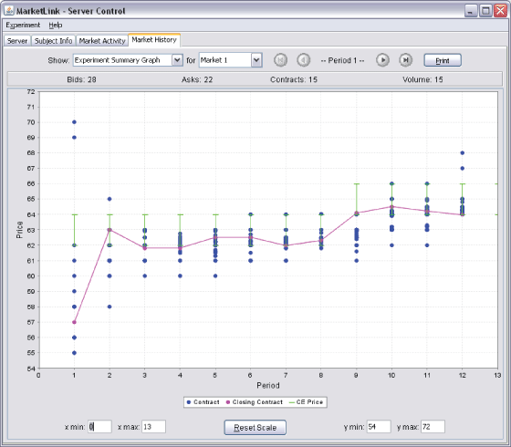
Experiment Summary Graph: This graph allows you to compare market history across multiple-periods. The blue dots represent contracts that occurred in each period. The purple line represents the last contract of the period. The green line segment represents the competitive equilibrium price range, and in the screen-shot below there is an increase in the competitive equilibrium price range in the 9th period due to an increase in demand.
(Click here to open a window image)
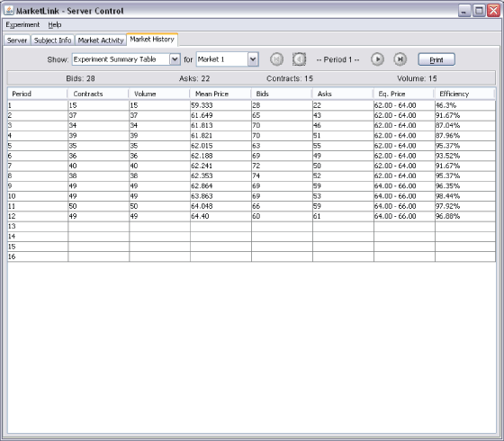
Experiment Summary Table: In this summary table one can compare contracts, mean price, bids, asks, and market efficiency across periods.
(Click here to open a window image)
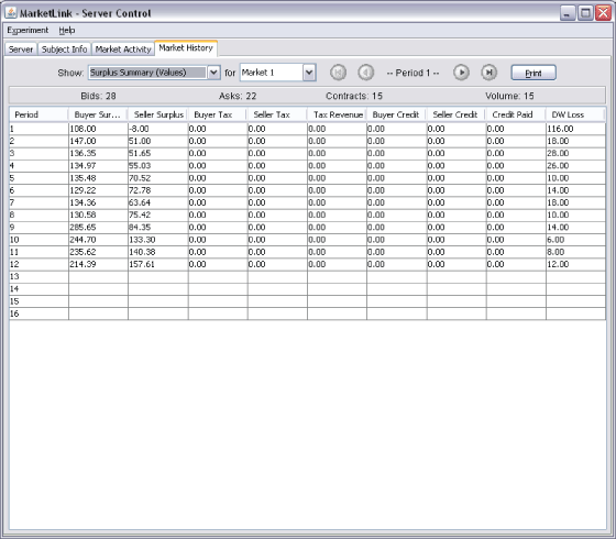
Surplus Summary (Values): In this summary table surpluses can be compared across periods in dollar values.
(Click here to open a window image)
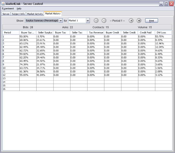
Surplus Summary (Percentages): In this summary table surpluses are represented in percentages. Notice that the DW loss percentage is equal to 1 minus the Efficiency percentages.
| Copyright 2006 Experimental Economics Center. All rights reserved. | Send us feedback |


