|
|
|
|
Using a GraphThe same information that is presented using words or a table can also be shown on a graph. In economics, we typically use a two-dimensional graph that has the price of the good or service on the Y-axis (vertical axis) and the quantity that people are willing and able to buy (or willing and able to sell) on the X-axis (horizontal axis). This way of presenting the information corresponds to the tables on the previous page. For example, the information presented in the first table can be shown on a graph as: Each point on the graph represents a point on the table. The top points show that when the price of a bottle of red wine is $20, producers are willing and able to sell 45,000 cases of wine but consumers are only willing to buy 30,000 cases. Using the terminology presented above, the "quantity supplied" of wine is 45,000 and the "quantity demanded" is 30,000 when the price of a bottle of wine is $20. The bottom point shows that when the price of a case of red wine is $10, producers are only willing and able to supply 25,000 cases of red wine but consumers are willing to buy 50,000 cases of red wine. When the price of a case of red wine is $16.25, producers are willing and able to sell 37,500 cases of red wine and consumers are willing to buy 37,500 cases of red wine. At this point the supply and demand curves intersect, this point also represents market equilibrium. 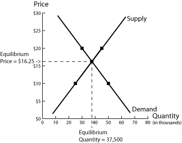
Next: Using an Equation Back to Market Equilibrium
|
| Copyright 2006 Experimental Economics
Center. All rights reserved. | Send us
feedback |
|